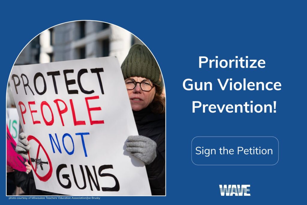
Page Hero with short paragraph header. Text box should be placed according to subject of image. Adjust padding and placement.
This page contains several useful patterns and some guidelines for colors and typography to help you keep the website consistent and make adding new pages and content much easier.
While you can add reusable blocks you must remember to convert them to regular content or you will alter the original block and all locations where it is used. Therefore it may be easier to open this page in a separate tab and just copy paste from here.
Basic Text Column
We use this for most body copy on pages to control the text width for readability and to maintain a consistent look and feel across the site. You can see it in action as the intro text on most pages. It is made up of 3 columns with an empty column on each side of the main text area that stacks on mobile. The main text area is restricted to 780 px which provides comfortable reading length with the site’s standard font size.
Above is a spacer divider you can use between areas to give some separation and breathing room. You can also find this as Reusable Block in the + menu at the left.
Below is a row of information boxes you can use.
Title Text Goes Here
This is the blurb text for this “box” which shouldn’t be too long so that it doesn’t become a tall item. This is about right right here.
Title Text Goes Here
This is the blurb text for this “box” which shouldn’t be too long so that it doesn’t become a tall item. This is about right right here.
Title Text Goes Here
This is the blurb text for this “box” which shouldn’t be too long so that it doesn’t become a tall item. This is about right right here.
Two Equal Column Row Layout
The area at the right can be an image, an info box or whatever bold element makes sense. This left column is for some text. The columns can be switched easily using the arrows that appear when you have a column selected.
List of Items with Blurbs (like Resources)
List Items with text and arrow in basic content width
These have roll over states and the entire box is linked for easy use on phones.
Community Violence
Community violence refers to acts of violence within a community or neighborhood. It may happen between strangers or individuals who know each other, but it generally occurs in public places.
List of Action Items with Blurbs (can use image or icon)

Sign Jennifer’s Petition to Wisconsin’s Legislature Urging the Passage of an Extreme Risk Law
These have roll over states and the entire box is linked for easy use on phones. These description blurbs should be short.
Another Action Item That Links to EA
These have roll over states and the entire box is linked for easy use on phones. These description blurbs should be short.
A Different Action Item Method
This is a set of columns with a heading, text and button block on the right and an image or icon on the left. You can also use just this group from the right.
Some Design Basics
Colors
A set of colors has been saved in the theme and will be available for most blocks.

Images
There are two standard sizes of images in use – backgrounds, and featured/body images.
Background Images should be between 1920 and 2000 pixels wide. The height may change depending on the image and the area it is used in. Background images should not be bigger than 2500 pixels wide or over 1600 pixels tall to keep file size manageable.
Standard Images should be 1200 x 800 to keep them consistent. Some areas of the site will resize them and even change proportions (Blog grid). Images should ALL have unique filenames and be saved either as .jpg or .png. File size should be under 500 kb if possible and the smaller the image the smaller the file size should be.
Style Examples (H1)
Heading Level 2
Paragraph formatted area Lorem ipsum dolor sit amet, consectetuer adipiscing elit, sed diam nonummy nibh euismod tincidunt ut laoreet dolore magna aliquam erat volutpat. Ut wisi enim ad minim veniam, quis nostrud exerci tation ullamcorper suscipit lobortis nisl ut aliquip ex ea commodo consequat.
Heading Level 3
Paragraph formatted area Lorem ipsum dolor sit amet, consectetuer adipiscing elit, sed diam nonummy nibh euismod tincidunt ut laoreet dolore magna aliquam erat volutpat. Ut wisi enim ad minim veniam, quis nostrud exerci tation ullamcorper suscipit lobortis nisl ut aliquip ex ea commodo consequat.
Heading Level 4
Paragraph formatted area Lorem ipsum dolor sit amet, consectetuer adipiscing elit, sed diam nonummy nibh euismod tincidunt ut laoreet dolore magna aliquam erat volutpat. Ut wisi enim ad minim veniam, quis nostrud exerci tation ullamcorper suscipit lobortis nisl ut aliquip ex ea commodo consequat.
Heading Level 5
Paragraph formatted area Lorem ipsum dolor sit amet, consectetuer adipiscing elit, sed diam nonummy nibh euismod tincidunt ut laoreet dolore magna aliquam erat volutpat. Ut wisi enim ad minim veniam, quis nostrud exerci tation ullamcorper suscipit lobortis nisl ut aliquip ex ea commodo consequat.
Heading Level 6
Unordered list standard:
- Thing – use paragraphs to get items into list (full return)
- Another thing
- Third thing
Ordered list standard
- This is the first thing in the list
- This is the second thing in the list
- This is the third thing in the list
Icon List Block
This is using “Pull Quote” block. mmy nibh euismod tincidunt ut laoreet dolore magna tincidunt ut laoreet dolore magna aliquam erat volutpat. Ut wisi enim ad minim veniam, quis nostrud exerci tation ullamcorper suscipit lobortis nisl ut aliquip ex ea commodo consequat. Duis autem vel eum iriure dolor in hendrerit in vulputate velit esse molestie consequat, vel illum dolore eu feugiat nulla facilisis at vero eros et accumsan et iusto odio dignissim qui blandit praesent luptatum zzril delenit augue duis dolore te feugait nulla.
Person Name Citation
This is using “Quote” block .Lorem ipsum dolor sit amet, consectetuer adipiscing elit, sed diam nonummy nibh euismod tincidunt ut laoreet dolore magna aliquam erat volutpat. Ut wisi enim ad minim veniam, quis nostrud exerci tation ullamcorper suscipit lobortis nisl ut aliquip ex ea commodo consequat. Duis autem vel eum iriure dolor in hendrerit in vulputate velit esse molestie consequat, vel illum dolore eu feugiat nulla facilisis at vero eros et accumsan et iusto odio dignissim qui blandit praesent luptatum zzril delenit augue duis dolore te feugait nulla.
Citation Area


